Rentalcars.com
- Client: RentalCars.com
- Date: 18th February 2019
- Project: Capture precise user location and present more relevant car hire search results for users in the non-airport sales funnel
- Goal: Improve conversion rate by at least 5% for user in this sales funnel
The client & project
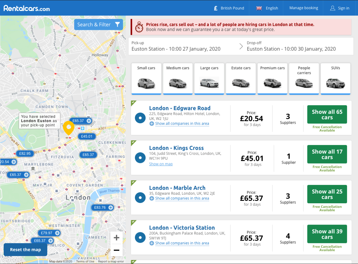
Rentalcars.com is a car rental agency that allows a user to book a hire car from numerous partner branches located throughout the world. The branches are primarily located near airports and this is where users generally pick up and drop off their hire cars.
There are occasions, when a user would search to pick up the car from non-airport locations, such as a city e.g. London, Manchester, etc. On these occasions, the user would mostly type a city name as their pick up point. This caused a problem for both the user and the client as RentalCars were not able to present the most relevant search results, as they did not know exactly where in the city the user wanted to pick up the car from. There was a hypothesis from the business that this was the reason conversion rates were significantly lower than ‘airport’ searching users.
Role & responsibilities
I was to deliver a UX change to the main car search component, in order to encourage the user to enter a precise pickup location when performing a “non-airport search”. These were the specific goals:
- Improve conversion rates by at least 5% for users in this sales funnel.
- The change to the component had to be only visible to users who performed a non-airport search and must not impact the existing sales funnel in any way.
- The work needed to be completed in a short time frame, so had to be straightforward to implement and involve minimal additional development work.
- Collaborate with product development and engineering teams to research, design and implement this project.
Competitor research
To kick start the ideation process, I performed a non-airport search on the main competitors’ sites and took relevant screenshots from each site.
I compiled the competitor research list, along with some of my own ideas, into a shortlist of potential approaches and wrote each approach onto a post-it notes and stuck them on the wall in a discovery meeting with stakeholders and developers.
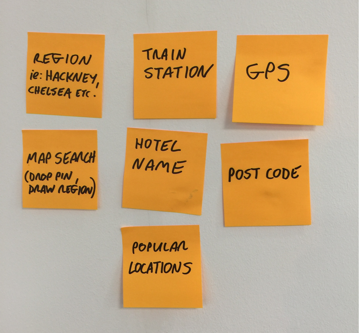
[Potential problem solutions]
I did this to give the ideas visibility and to encourage discussion on the most suitable solution(s) in the meetings.
Wireframes & Sketching
After distilling the customer research and shortlisting some approaches, I created low-fidelity wireframes in order to iterate through design options quickly.
I held a brief meeting with the product owner and developer to present the low-fidelity wireframes which I used as a starting point to discuss the most suitable option to solve the problem.
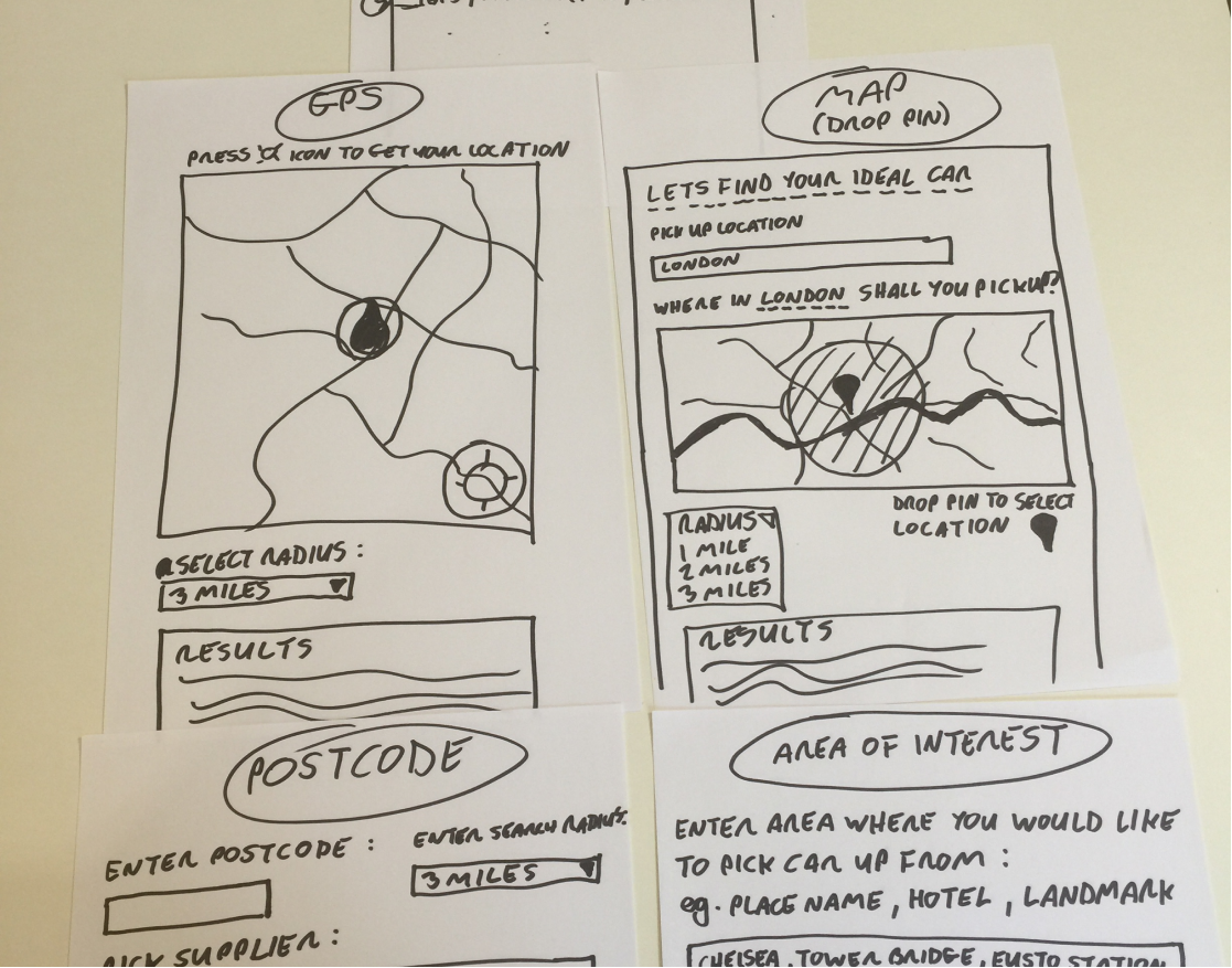
[Sketched wireframes of solutions]
Following a review of the wireframes, it was agreed that we go with the following solution:
*Display a secondary search input text field (only for users in this type of search funnel), below the primary search field, called ‘ tailor pick up point’ which would only display when the user entered a non-airport pick up location.
*This field would then allow the user to perform an auto-completed search term which contains major landmarks, districts and buildings (such as train stations) in order for them to provide their exact pick up point.
We chose this solution to take to design and prototype for the reasons:
- We already had this type of auto-complete metadata available (such as train station, district, etc) in the search results algorithm.
- We felt that the user wouldn’t know that you can search by this metadata type, so adding a specific search field would encourage them to do so.
- We felt this was the most suitable solution to implement within the strict time constraints of the project.
- I had initially wanted to implement a GPS based location solution, but this would have involved a lot of additional development work, time and budget. The user would also have to specifically allow the browser to access their GPS location, which may have caused issues.
Visual Design
Following agreement on which approach to take, I designed high fidelity screen mockups with two variations on the style of the new search field.
In the first variation, I added a blue border and step tab around a new secondary search field called “tailor pick up point”. The purpose of this was to visually draw the users’ eyes to the field to encourage them to complete it. Although the field was not mandatory, a project goal was to encourage interaction with this field and obtain accurate pick up location data.
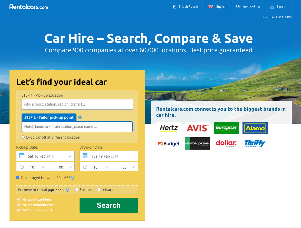
[Solution 1 : New input field with blue border and tab]
The second variation featured the secondary field in a more a subtle way that mirrored the design pattern of the existing search field.
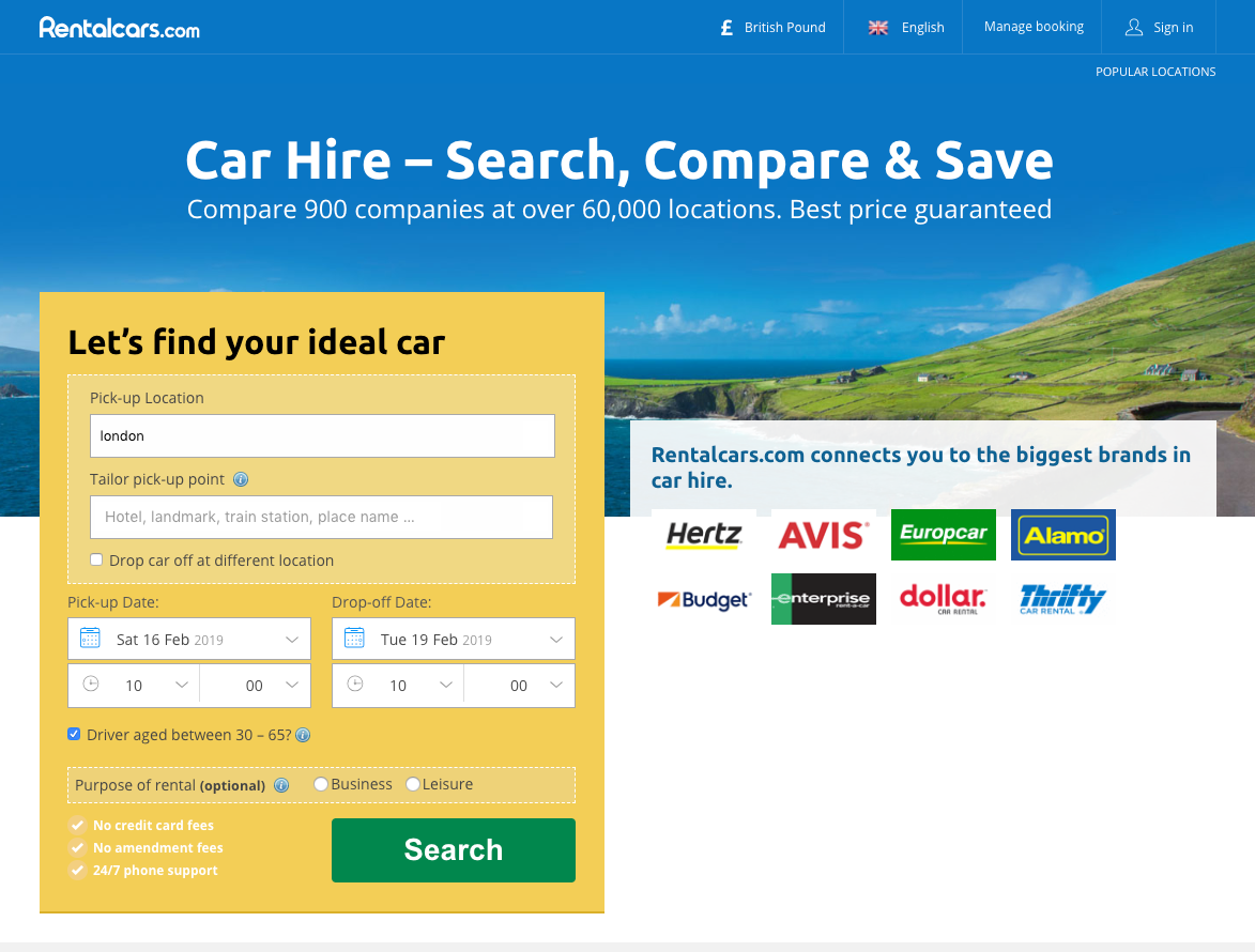
[Solution 2 : New input field with similar design]
I visually grouped both the search fields (on both solutions) with an existing dotted border style which was already present on the page too. This was to ensure design consistency and not put an additional cognitive load on the user.
I also added the common ‘tool tip’ icon next to the form label with an information panel appearing on hover/click, the purpose of which was to explain what the function of this field was to the user. I felt this would be quite important to include as it may not be obvious what the purpose of this field was.
User Testing
I had to glean insights in order to validate (or not) that the proposed solution would achieve the project goal and that users would understand how to use the interface. To achieve this, I set up a user testing session using the ‘What users do’ online platform and setup two distict user groups, each with a seperate car pick up point.
- Group A - I assigned their pick up point as ‘Euston station’.
- Group B - I assigned their pick up point as ‘London’.
I created these two groups as I wanted to gain insights into how users in Group B would behave when they only know the name of the city as a pick up point. If a user has zero local knowledge of a city, how would they know where exactly to pick up the car? What would they do?
I ran the test on fifty test subjects, three of which adopted the persona ‘A’ group, and the other three personas ‘B’.
[Example of prototype in action]
Included here is a link to the basic clickable prototype based on Solution 1 above which is the the design with the blue border and tab around the secondary search input field.
Observations
The following was a selection of the feedback received from the user testing sessions:
Persona Group B - ‘Euston’ search
- Started typing in London in the primary search field to begin with.
- Then started typing in Euston in the secondary field. Thought it was obvious that was what you were meant to do.
- Found the interface easy to use.
- When I asked; “If you didn’t know you had to pick it up at Euston and just wanted the generic location in London”, she said she didn’t know what to do and just said, “Surely I know where I am picking up from?”.
- Did not cross my mind to just hit search.
Persona Group A - ‘London’ search
- Talked through, said he would choose London and then did so
- When the second box type came in he said he would just think of place in London that is central
- Did not cross his mind to just hit search
- When seeing the multiple choices for Euston on the interface, he thought customers could get confused and choose the wrong one.
Persona Group B - ‘Euston’ search
- Started typing - Said he would type in Euston immediately - prototype goes straight to London generic
- When the second box came up - said he would search for Euston immediately.
- When asked, if you didn’t know where in London to pick up - he said he would find somewhere in London he wanted to pick up
- Did not think to just hit search and search for all of London
[Search listing page yielding more accurate rersults]
Persona Group A - ‘London’ search
- Started to type in London
- When the second box appeared, she said she would want to type in her hotel or where it is she is staying
- She said it wasn’t too obvious what it is she needed to do and would prefer to see a drop-down list of locations
- She said she would check google maps beforehand if there was a drop-down list and didn’t know what the locations are
- Didn’t think to just hit search and search for all of London
Persona Group B - ‘Euston’ search
- Started typing, said he would have typed Euston station immediately, proto takes you to London
- When the second box appeared he said he would type in Euston
- From the choices that came, he said it wasn’t obvious that Euston was the station on not a town. (he missed the label station)
- When asked, if he didn’t know where in London he said he didn’t know what he would do.
Persona Group A - ‘London’ search
- Started to type in London - when the options appeared he said he would have chosen victoria station from the suggestions because that’s something he knows.
- The second box appeared - he thought he lost his options - seemed really puzzled about what to do
- After some questions said he would have typed in victoria stations cos that’s where he knows.
- Then hits search
- Didn’t think it was clear what he had to do until he read the tooltip.
- Didn’t think to just hit search.
Insights
The main takeaway points from the user testing were:
- Everyone felt compelled to enter something in the ‘tailor pick up point’ box and not one person thought to just hit search and see everything in London.
- Only one person went to type ‘Euston’ in the primary search field.
- Several users seem confused by the secondary search field until they clicked the help icon, we had assumed it would be obvious what to do here!
- The majority of users reported that they thought the second field was mandatory, particularly in the design variation where the field had a blue border and tab around it.
The insights obtained from the user testing helped in selecting a design option. The blue border and tab in solution one made it appear as if the field was mandatory (it wasn’t) and we didn’t want users potential dropping out of the funnel at this critical stage, so decided to drop solution one and go with solution two.
Learnings
- It’s very easy to get married to a design solution and adopt a blinkered “it’s my baby” attitude. Just because an interaction pattern is obvious to you and those around you, it may not be to the end-user and that is ultimately what can make or break the success of a project. You must always test your assumptions with users in order to validate your hypothesis, no matter how ‘right’ you think you are!
- I learned that in a project with a short time frame, it is best to really nail down exactly what the stakeholder requires. It was apparent the stakeholder had a specific idea of how to solve the problem and I could have saved some research time had this been more accurately communicated to me. I will double and treble check project requirements of this ilk in the future!
- During the user research process, I was surprised to learn that users thought the new secondary field was mandatory, as it did have an asterisk attached to it - as is the usual design pattern to indicate this. Again, never assume anything, just because I know an element is a ‘globally recognised design pattern’, doesn’t mean that end-users think and know this.
- While the whole project was a great learning experience, I especially enjoyed seeing how users interacted with my designs, even though they did not behave exactly as I thought they might!
Result
The new search component was initially run in production as an A/B experiment where 50% of users performing the non-airport search got the original search component and the other 50% got the new secondary search field. We ran the experiment for four weeks and before we turned it on, measured the conversion rate of each user who went on to book a car and performed a non-airport location search. This was so we could compare and measure how successful the journey and UI performed against this benchmark figure.