Morrisons
I joined the Morrisons Digital team in Manchester as an innovation UX developer to work on the brand new eCommerece platform and website the company was about to create.
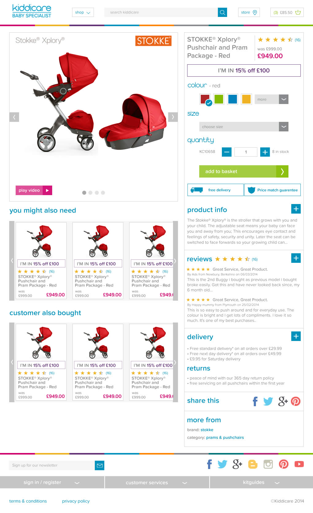
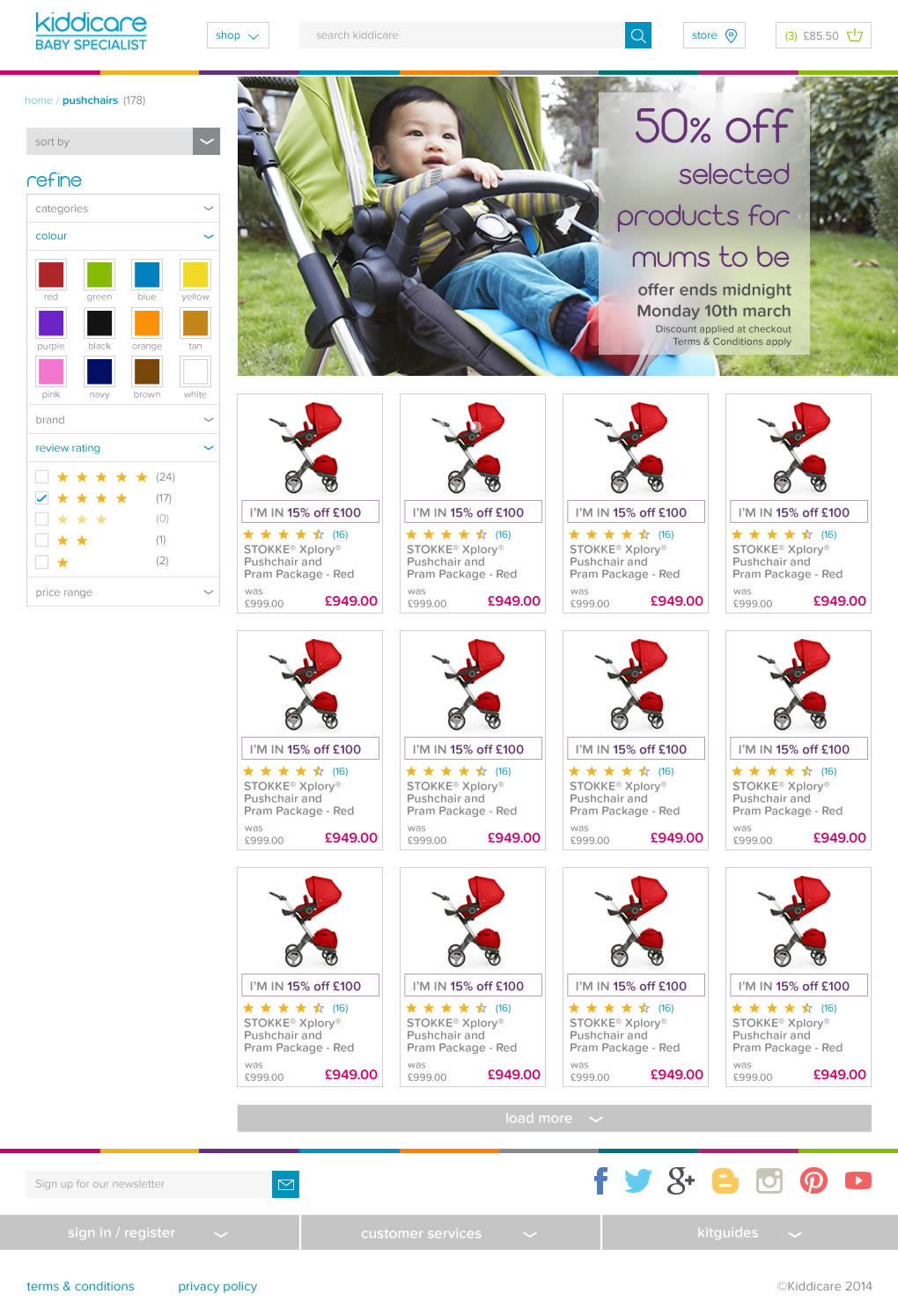
I worked on creating the visual designs and front end development code of the new site, in addition to working on the Kiddicare brand.
The designs and code were unfortunately never put into production as mid project, the business made a decision to acquire Ocado and use their existing platform.
I have misplaced the full set of concepts, although I do have the homepage which can be viewed above. After a few iterations, the designs were well received at Bradford HQ and met with board approval.
Kidicare native app web forms
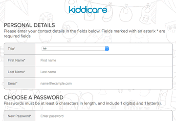
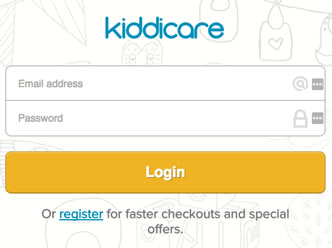
Another small piece of work I did while working at Morrisons, was to build some web form views for a native app we were building for the Kiddicare brand
This was only a small piece of work but was quite a useful exercise learning nonetheless, as this was a standalone piece of code to write, it allowed me to put the new SASS and Compass framework skills I had been learning, into practice.
Live demo
Click each of the two images below to load the respective form page in a browser. This demo is hosted on this site.
The forms were both used as a webview on the Kiddicare apps created for iOS and Android.
You can view all source files and code I wrote on the Github repo I created for the project.
Kiddicare @ Morrisons - Repsonsive site redesign
UX lead on a project to convert and re-design the existing Kiddicare website into a responsive site.
Kiddicare are a multi-channel retailer specialising in baby products who Morrisons acquired in 2014, for whom I was working for at the time.
Directly responsible for:
- Converting business requirements into wireframes
- Homepage rapid prototype
- Visual design for web page concepts
Wireframes
Working in conjunction with a business analyst, I produced wireframes of all key screens at mobile, tablet and desktop views, and also created click-able regions in order that a sample user journey could be followed in a demonstration.
I also exported the screens as JPG’s which I pinned to the walls of project design meeting, the purpose of which to encourage collaborative iterations of the positioning, prominence and inclusion of screen elements.
Samples of the wireframes I produced can be viewed by clicking the button below:
Prototype
The proposed design for the layout of the new homepage involved a complicated product grid (similar to Pinterest).
The behaviour of this layout grid, particularly at different screen sizes, was proving difficult to convey to stakeholders in static wireframe form.
To resolve this problem, I built a HTML prototype of the homepage (using the Foundation framework) and demonstrated this direct in a web browser. This prototype helped in stakeholder understanding of the interface and in achieving sign off.
Visual Design
I was also responsible for producing visual design concepts for the look and feel of the new website, examples of which can be seen below.


Front end development
I was also responsible for building on the front end code for the production website. The company has since been sold and taken over and the site no longer live so I unfortunately cannot link to the finished version.

